
How many people like filling out forms? You guessed it, not many. Users want to checkout in a frictionless manner and creating an account is unavoidable. In this case study we read how the users behaved on the sign up page and we redesigned it accordingly.
SKILLS USED:
UX Research
Contextual Interviews
UI Design
TOOLS USED:
Sketch
hotjar.com
The Challenge
The original design of the page had no design guidelines. It only included the required fields stacked on top of each other with no reasoning behind it other than the technical and business requirements. All branding has been hidden from this article for the confidentiality of the brand.
Survey Findings
I took a sample of 999 users on the span of three days where the traffic was average on the website. But it was during three running advertising campaigns which meant that users have a higher rate of signing up and creating a new account. Using Hotjar Forms tool, we collected the below data. Each column represents a field that was required to fill, the number of users that interacted with the field, the average interaction time, the refill count and successful submission count.
Data collected by Hotjar Forms.
Key Learnings
807 visitors (80.8%) left the page without interacting with the form.
92.54 seconds spent on password creation & half the time was spent on confirming the password.
Only 4.2% of the users succesfully completed the form.
Of the users who reached the password creation stage only 26% made it out.
The time spent on the field of D.O.B. recorded an above average rate with 25.8 seconds.
42.9% refilled their mobile number, that’s also a high rate.
The Redesign
After taking into consideration the business requirements I sketched the layout, tested many online forms and read a lot about form guidelines. And this is what it came to be:
Great! Let’s dissect it!
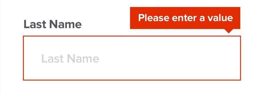
Error Messages
Another layer to forms is the error messages, which makes the form more alive. In this case I suggest to apply the two-state validation pattern. But what is that?
“Form validation” refers to putting particular error messages next to text inputs when the user enters a “bad” value. The two most important questions to that are:
When should the error message appear?
What should the error message say?
It’s tougher than it sounds because the naive solutions are pretty noticeably bad. Validate on keydown (typing in the field) and the field yells at you while typing. Validate on blur (pressing/tapping outside the field) and if the users want to correct the input, they have to go back to the field, press/tap outside to see if it’s correct and go back again - you get the picture! Extra clicks are annoying! Also, when the user blurs it, it usually means they’re done with the field.
Do you see the issue?
Enter the two-state validation pattern!
Wait until the first blur to validate the field
After the first blur, validate on keydown