
HiCart.com App UI
HiCart.com is an e-commerce startup that was launched in Lebanon in 2017. Initially, the platform was developed as a responsive website.
One major business goals was the mobile app switch and my challenge was turn the original product into a user friendly application in two weeks.
SKILLS USED
UI Design
Wireframing
Prototyping
TOOLS USED
Sketch App
Zeplin
Homepage
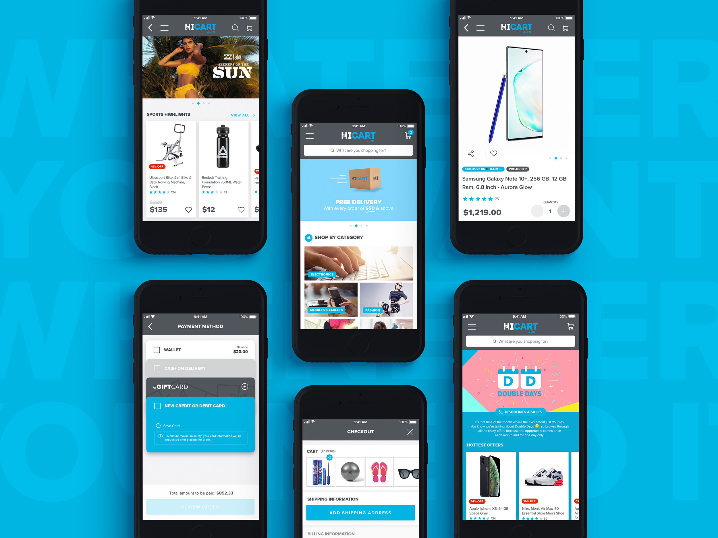
In order to convert the website into an app the whole journey and experience had to be reimagined and the question later became ‘how can I develop a mobile app with the best user experience? Taking into consideration the existing communication with the server and saving the developers extra effort due to the tight deadlines. The website’s Homepage consisted of a main navigation, a hero banner, smaller banners for ads and a long list of carousels. When replicated on an app, the visual design of these carousels won’t convey information as quickly and easily as one expects from an app. Therefore, I integrated a bigger variety of modules the user can interact with and kept the essential carousels on the homepage.

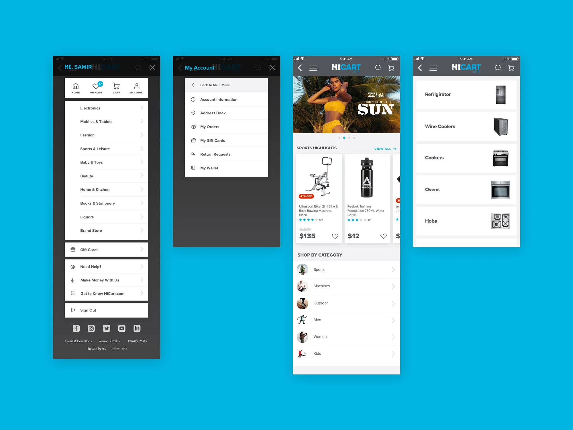
Menu & Navigation
Given that the app runs on both stores, the navigation bar had to be consistent, guiding and familiar to both Android and Apple Users. However the menu almost contains every tools available on the platform with all the website categories.
Additionally, all the carousels that were present on the website’s homepage are now placed in their respective category for more relevance.
Product Card
Converting to the app meant also the product card had to be redesigned. The original design had a lot of usability issues such as the hierarchy of the information, the tags except the discount was added manually on the product image, the cart icon was filled but the others weren’t, the rating if available was outlined in blue and if not it was outlined in grey!
Now the app card definitely needed a simpler design, I first filled the rating stars, designed one tag for different purposes, fitted more text for the title, highlighted the price and got rid of the icons and kept the wishlisting.

Cart & Checkout

Promotional Campaigns
Ecommerce marketing is the practice of driving top-of-funnel traffic to convert into sales and customers. And at hicart.com the frequency of these campaigns was very high and required special pages. We classified these pages into two categories, The Pop-up Shop, which is a parent category with multiple sub-categories and Offer Pages which is one page of product listing. Both pages required hero banners but The Pop-up Shop included additionally sub category images.
Now for the app homepage widget I added a campaign description, a carousel of the top offers, two highlighted sub-categories, while the Offer Page was designed in a simpler manner. I later found out that this widget can be targeted towards brands seeking to promote their products, thus the ‘sponsored’ tag was added to link you to an ‘Advertise Your Products’ page.

Supermarket
This section was added at a later stage with additional requirements to a regular order. Once you enter the Supermarket category you are asked to provide your current or delivery location. The app then offers the available supermarkets in the selected area and directs you to their selection of products.
The data architecture of the categories of supermarkets required an additional sub-level which was added in the product listing page for a faster navigation.
